a_Bahn | visual identity
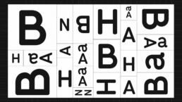
The a_BAHN visual identity is based on a very simple typographic logotype, designed as a responsive element that fits to fit all kind of media and ratio, all the way to their edges.
a_BAHN no longer only produces films but focuses on a wide range of new media too.
Motion design has been part of the design process from the beginning so that a large range of digital scales and formats could enhance the more traditional print designs.
If there is a well defined static design of the logotype, it is always combined with a dynamic and living variant.
a_BAHN is a visual identity in perpetual motion.
Design : Studio Michel Welfringer
Fabrice Dehaeseleer & Michel Welfringer
Motion design : Antonin Waterkeyn